Subway Art with the Silhouette Cameo and contact paper
Subway Art. It's just not getting old with me. Yet. Ask me next year and we'll see if I edit this post. ;)
I wanted a piece of that subway art in our home. But I wanted it to have meaning. So I choose to create memory subway art: people, places, and times that hold a special place in my heart, as well as my family's.
How in the world was I going to get those crisp, clean fonts to pop on my board? I wasn't going to get the same look with hand painted lettering. I knew I could use vinyl and then pull it off, revealing the paint underneath. But that's kind of an expensive way to waste the vinyl and I'm all about saving where I can. So, when I heard that people can use contact paper instead of vinyl, well giddy up sista, cause I'm on that train! (I've never used that phrase before and promise not to use it again).
Okay, so after deciding on my "memories" and my fonts, I printed each one out on contact paper. Here are the settings: Media - vinyl; Speed - 8; Thickness - 3; Blade - 2.
Just an FYI: I am no expert at Silhouette. I've hardly used the machine and I'm hoping to carve out some time to learn through tutorials. But what I did learn is that the rollers and me, well, we're not friends. If I don't make the rollers happy by making sure the paper is perfectly wide enough to grip it correctly, it never comes out right. Ugh. In the end, I felt like I had a lot of waste. But, I did get a killer deal on discounted contact paper at Home Depot. It turned out to be .17/linear foot. Giddy up! (sorry, again)
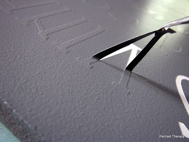
After printing the lines, I cut them individually and peeled back the film to reveal the wording. (Note: use colored contact paper otherwise you won't see what the heck you are working with).
Use your hook tool to get rid of the bits of contact paper that didn't come off.
When all the strips were ready, I lined them up in the correct order and got an idea for how big I needed my board.
I cut my board and decided I wanted the lettering to be white, so I painted the board white. Rolling paint kicks butt.
Now, I needed to transfer the lettering to the board. Silhouette sells transfer paper. But, remember, I'm cheap. So, instead, I used clear contact paper. I cut them to about the size of my strips and pushed down really good.
 | ||
| This shows putting a clear strip of contact paper over the contact paper lettering. |
Next, I pressed the first strip into place. Use your handy-dandy YMCA membership card to press it on good. Fine, use your credit card instead.
 |
| Putting a lot of pressure on the YMCA card |
I made sure to use a ruler to check all my measurements after and before each new strip. I wanted even space on the left and right, as well as pretty evenly spaced between lines.
When finished putting the words on, I was kind of in love. At this point, I was so psyched with the way it was coming out. But not psyched enough to leave the contact paper on.
 |
| Looking good! |
For the love of Pete, if you learn nothing else from this tutorial, learn this: PAINT OVER THE LETTERS WITH YOUR BASE PAINT!! This will seal the edges so the next color paint you put on will not seep under your lettering. You want nice, crisp letters?!? DO IT! Okay, I think I made my point.
 |
| A few very light coats will work. |
After this layer of paint has dried, add your top color. Since I just did a whole living room re-do with grays, I decided on a slate gray color. After the few coats of that bad boy had dried, it was time to take the letters off. See, this is where the vinyl would be wasted. I'm just using the contact paper letters as a template, if you will. At .17/linear foot, I can sleep at night.
If you heeded my warning suggestion, your letters should be crisp and clean. Don't they just look baaaa-u-ti-ful?
You can leave your sign here, but of course, I had to do a little distressing. I used a very find sandpaper on my electric sander and went to town.
 |
| You can see the distressing on the edge of the sign. |
That's it. I didn't even seal it as it's just going on my wall and I'm not expecting little hands to touch it. Now it's a big part of my family wall vignette.
I love signs and I love fonts and I'm fond of memories. The perfect combination.
Debbie
Sharing with:


Comments
Post a Comment